Friday 8 April 2011

powerpoint evaluation


music magazine finished.

This is my finished front cover for my music magazine which i produced on software called Photo shop. i am really pleased with what i have made and i think it does look very professional because it has a lot of the conventions you find in magazines such as a main image, cover lines and puffs. i like the colour scheme which i have used on the front page and also the fonts are quite effective in making parts of the magazine stand out, for example 'REAL ROYALTY' and 'E X C L U S I V E'. The layout which i have used is also quite effective in making certain parts stand out. i have a box at the bottom of the front cover showing the most exclusive news in the magazine which could entice people to buy it. There is also a list of artists who have released new singles on the right hand side of the page which will make people want to buy the magazine if they like the artists which i have listed. There is a quote from another established music magazine which talks about the band on the front cover showing they are good as it says ' Best newcomers to the music industry' which is quite an achievement for these 4 guys.


This is my contents page for my music magazine and i am pleased with what i have made. The background of the magazine is working very effectively in making things stand out on the magazine and looks better then having the background just plain white as that is quite boring and would make the magazine look too plain. The layout of this contents page looks professional and has worked very well with the 2 small images at the bottom right, one small image in the top right and a larger image middle right. All these images have numbers which relate to the article to which they are numbered at. The colour scheme is similar to the front page and also works very well on this page. The fonts are clear and stand out when i want them to stand out e.g. the title 'REAL ROYALTY' is in gold to draw attention to it first instead of anything else also people relate the colour gold to the royal family which gives it a bit extra meaning. i have added effects to the pictures to help them blend in with the magazine so it looks more professional which is what i am aiming to make it. There is a features column and regulars column showing the content of the magazine.


This is my double page spread for my music magazine and is personally my favourite piece out of the front cover, contents page and this as i think it looks the most professional and i can't really find anything on it that i would change which shows i have done a good job in what i have made. The first page has 2 pictures on it, one of the whole team who work in making The Entity what it is becoming and one of the actual groups members, both of these pictures have effects on them which helps them to blend in to the background. There are lots of articles on this page which are all about The Entity and how they became a group, how to find them on Facebook,YouTube and also an article of questions which have been answered by the whole group. The second page of this double page spread has a picture of the band member who created the band 'Jack'with large font saying 'THE REASON FOR THE ENTITY' which i think looks very effective with the effects which i have put around it to make it stand out and not look plain.

Thursday 7 April 2011

Music Magazine

This is a rough layout for my music magazine double page spread which i made on microsoft publisher as i didn't have the right software at the time which was photoshop. i think even though i made this on publisher it looks quite professional and will look even more professional when i do re create it onto photoshop. i really like the layout which i have created on this double page spread and i think the final piece is going to look better then i think. The colour scheme is going to be the same as the front cover and the contents page when i do get round to creating it on photoshop.

Music Magazine

This is a rough copy of my music contents page for my magazine as i didn't have a computer at the time that had the right software which i needed which was photoshop. I made this to make creating the contents page on photoshop a lot quicker as i already had a good  idea of what i wanted to create in terms of pictures, layout etc. The colours are not portrayed well on this page as the contents page that i make on photoshop is going to have the same sort of colour scheme as my front cover and the same with my double page spread.

Music Magazine

This is my music magazine when i created it on publisher becuase at the time i didn't have the technical equipment to use Photoshop. I like the layout which i have done and i like the colour scheme which i have. i have also used a lot of the aspects of most magazines such as plugs, cover lines and a strapline. Although this looks very basic at the moment when i re create it into photoshop it will look a lot more professional as i will have better software to use to give it the finishing touch.

Tuesday 5 April 2011

Fonts

ARIAL ROUNDED MT BOLD - i chose not to use this font because i thought that it is just a bit to basic and would  start to make the magazine look worse and not look as creative as i hoped it to be.
BRADLEY HAND ITC - This font is very different compared to the one above as it's a lot more swirly and i just think it could get hard to read and might put the reader/buyer of looking and then buying the magazine for such a small problem.
ERAS MEDIUM ITC. - This font is also quite basic and will just make my magazine look like every other magazine with this font which is not what i want as i am trying to create something different, something a bit more eye catching.
TEMPUS SANS ITC - I didn't use this font as i believe that even though it is the kind of font i was looking for it just looks a bit too scruffy and would put the reader/buyer of it,
CURLZ MT - This font is excentric for my magazine and i doubt you will ever see this font in magazines which is understandable because it is too curly and just wouldnt work in magazines as it would draw attention away from other aspects of the magazine which you want the reader to focus more on.
FREESTYLE SCRIPT - i dod not choose this font becuase the writing is really small compared to the other fonts and wouldn't work very well on the double page spread.
SNAP ITC - This font is just too wierd and bold for my magazine and is quite hard to read and would create problems, especially in the bigger articles within the magazine.
CALIBRI (BODY) - I chose to use this font for my magazine as i think that even though it's not the most creative out of my choice of fonts i really like it.  on the other hand it's also not the most boring of the choices of fonts, it's around the middle and is just what i was looking for to help in the creation of my college magazine.


Tuesday 1 March 2011

college magazine contents page.

This is my contents page that i designed and made for my college magazine. It has the normal sort of layout as most contents pages with Features and Regulars telling the reader a little bit about what is included in the magazine to try and convince them to buy it. i really like the layout i used with the features on the left hand side of the page and then the regulars on the right hand side of the page. i also put 3 pictures down the centre which have been edited and faded etc to add effect to each of them. i also put the bottom two at a bit of an angle to add a bit of character and dynamic effect so the page wasn't all straight and boring which most likely would not appeal to much readers. The collums of features and regulars i think have been layed out well and the two different shades of blue contrast eachother well on the page and also they overlap the photos that i took very well as you can still see the photo as both the collums are transparent so you can see through them. overall i like the contents page that i have made and i am pleased with the college magazine in general.


Tuesday 15 February 2011

College Magazine.


This is my college magazine which i designed and created. Theres a lot of stuff i like about it but also there is a few aspects of it which i dislike. An aspect i like is one of the colours of the font i have chosen and how it contrasts well with the background main image. The white font stands out very well against such a dark background and really draws you in to reading what it says. The dark red font doesn't work as well as the white as both it and the background are dark and so don't contrast as well as i had hoped. The Masthead title 'COLLEGE' in my opinion looks quite professional and very similar to other Mastheads that would be found on magazines in alot of stores. I really like the layout i have used on this magazine because i think it really looks professional and is spread out very well, all of the plugs etc are all around the edge so they do not take to much of the page up and also so it doesn't overlap onto the main image so you can't really see it well. The quality of the main image is not very good and really could be improved but i only had one chance of taking this picture and it would have been impossible to come back the next day with a better camera to take a picture with more qaulity. overall i am happy with the magazine which i have produced and look forward to creating an even better one for my next piece of coursework where i design and creat a music magazine.

Tuesday 8 February 2011

Photoshop

Today i found it difficult to use photoshop so i searched for advice and tutorials on the best and easiest ways to use the programme to help me with designing magazines and for any other times that i might need to use it. i found a video on youtube called 'adobe photoshop tutorial (removing backgrounds)' and then after found quite a few more tutorial videos. it was very useful in helping me get the hang of how the enitre programme works and also it helped with with certain aspects of it.


Research on Magazines

Whilst researching i found this page. This contents page is good as it has a good red and white spaced out house style and is appealing to any reader of the magazine. It splits the two main sections 'Features' and 'Regulars; which are very clearly displayed and easy to identify on the left had side of the page. This helps the reader to use the magazine and to find what they’re searching for with no complications. There are also clear pictures of things people might want to see or they recognise with the page number in the corner so you can flick to that page easily and efficiently. The words ‘Drummer’ in bold writing really draws in the reader to read the magazine as it backs up the idea of a cool and fashionable music magazine and is what the reader is looking for. Each feature has an individual name that entices the reader to look at that particular article as it says what exactly you will see in it, this is all done in just a few words. The small amount of information and just titles of the articles and is useful at enticing the regular buyers of the magazine as they now feel like they are part of the whole concept of the entire magazine. This contents page is also very easy to understand due to things like how well spaced apart the page which is done very well and won't confuse the reader as its very easy to read.

Tuesday 18 January 2011

Research on Magazines

This magazine has been produced very cleverly as is has put Cheryl Cole on the front which is clever because she is one of the biggest music artists at this moment in time and will entice anybody who enjoys upbeat songs, pop, hip hop and RnB music. As well as being an musical artist, Cheryl Cole is a fashion icon to a lot of people all over the world which will draw in a whole new potential audience to buy the magazine which could then lead on to this potential audience to carry on buying the magazine for years. On the right hand side of the magazine it says 'THE 10 BEST NEW ACTS', if the front cover appeals to them there may be more acts inside that could be like Cheryl Cole which is what first drew them to look at the magazine in the first place. That is just one of the ways the designer and publisher of the magazine are trying to make it appeal to their audience. All of the adverts and appeals round the edge of the magazine cover are all there to engage the reader into buying the magazine and this magazine does that well by also advertising other artists such as 'Vampire Weekend, Musk, Snow Patrol, Midlake, 50 cent and more'. The magazine has tried to put as many different genres and types of artists to attract different types of music lovers and readers to the magazine.
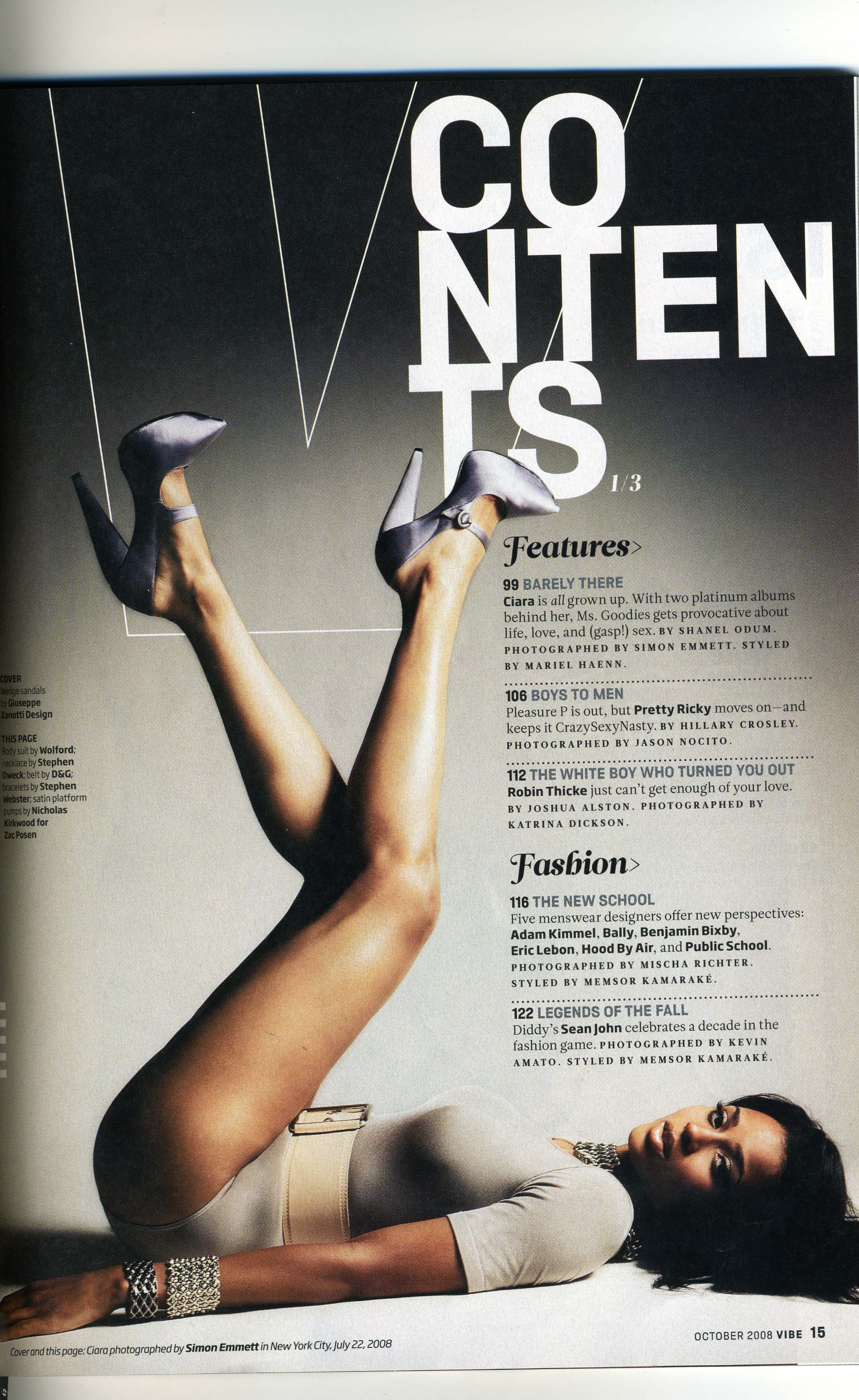
Research on Magazines

This contents page is very different to the one before. Whereas the last one was very focused on what was in the magazine and the articles inside I think this one is a lot more about the artist inside as you can see there is a picture of a woman which is the most eye catching feature of the magazine. There is a feature list on this contents page the same as the other magazine before but instead of a 'regulars' there is a 'fashion' section instead, this makes me think they are focused on fashion and music fitting in together. There is a very clear house style on the magazine which is a beige sort of colour with a white title and black writing which stands out very well on top of the beige background. Also the picture is taking up the majority of the page and very bold and centered so that it could be a way of drawing in the potential audience especially the younger generation. The main picture also would be very forward for certain target audiences as it shows the artist laying on the ground but also has fashionable clothes which would appeal to some of her audience which then would make more people buy the magazine.

Monday 17 January 2011

Television and Representation

Today i was looking at how there  is a major difference between the terms sex and gender.

I found that the term 'sex' will often be used by academics while defining those biological differences which separate women. These differences are determined by genetics and there is little room for debate or change in our biological make-up. Definitions of 'gender', however are cultural. The qualities which are identified which masculinity and femininity are very much debatable and certainly subject to a great deal of change over time.

Masculinity
Femininity
Professional
Domesticated
Strong
Weak
Rational
Emotional
Competitive
Co-operative
Independent
Communal
Aggressive
Passive
Ruthless
Sensitive
Ambitious
Supportive


This table that we created above shows how some of these stereotypical qualities are linked to our understanding of gender. These are not meant as descriptions of how men and women actually are, but rather they indicate the kinds of ideas out of which conventional representations tend to be built. It is worth nothing that female characters can be constructed out of the qualities which tend to be associated with masculinity. However we seemed to find that more often than not, the character will be portrayed in a negative light and 'punished' through the narrative for her actions.

Monday 10 January 2011

Television and Representation

The most common forms of representation in our culture are those which serve the dominant interest. Dominant groups will often promote themselves as 'normal', and dismiss those groups who are seen as different and therefore abnormal. The position of dominant groups comes about through the complex forces of history, economics and social politics.
    It has been noticed that their is and has been a constant struggle between dominant groups' sustain of position and the sub-ordinate groups attempts to gain recognition and status. Nevertheless, the fact that the dominant groups often control environments where power can be contested and restributed.
   The Television tends to rely on the dominant views of gender roles and stereotypes of masculinity and femininity. Most broadcast and production companies are run by men or have institutional practices which have been set-up by years of male input and decisions. Through this kind of orginisation, dominate or accepter views of gender are continually reflected in the programmes that make it to our screens, in turn, the constant use of particular representations serves to naturalize them, therefore making them seem 'normal' and without alternatives.
   
Dominant
Sub-ordinate
Male
Female
White
Other ethnic groups
Middle class
Working class
Middle aged
The young/The old
Heterosexual
Homosexual/Bi-Sexual
Able-bodied
Disabled