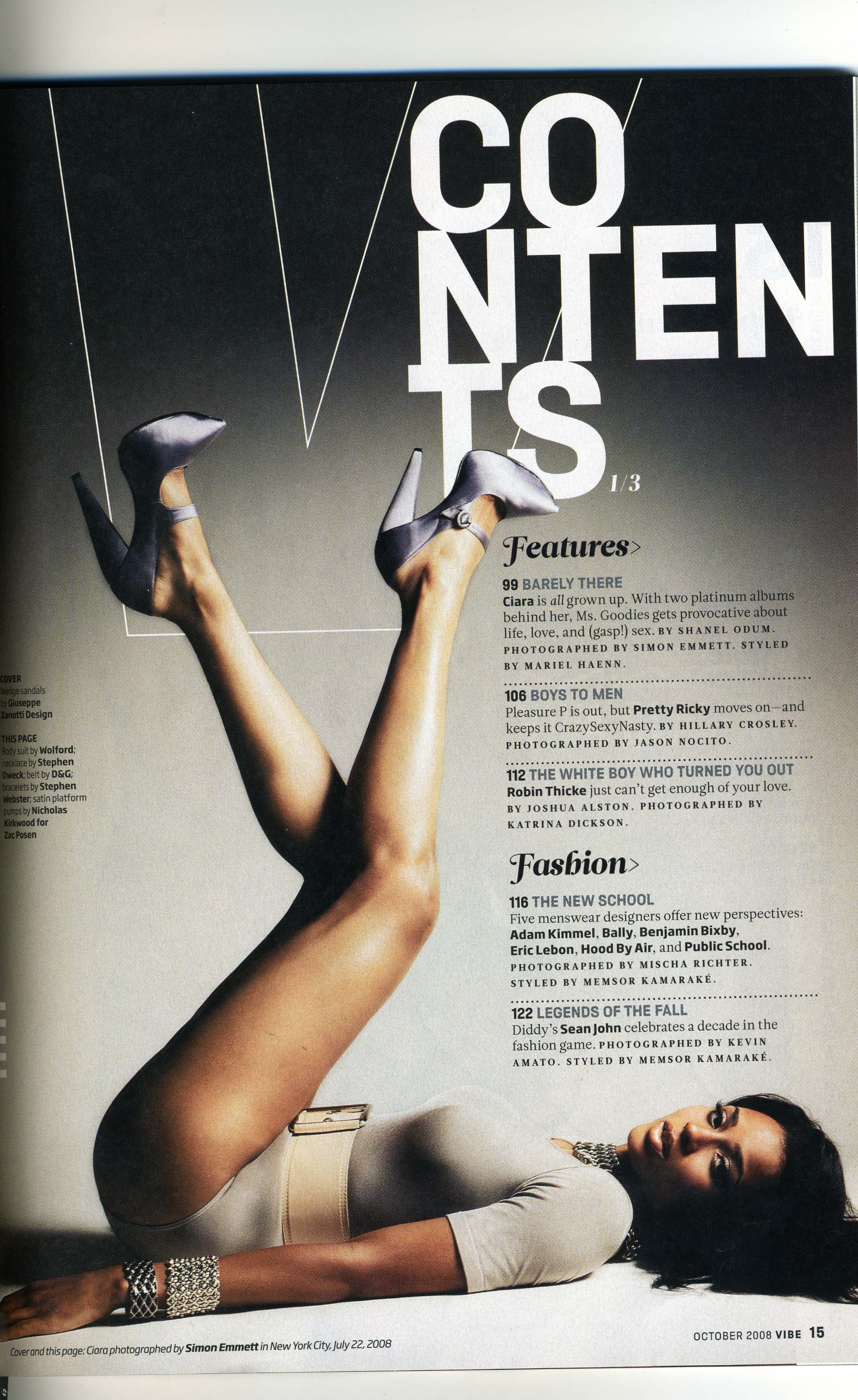
This contents page is very different to the one before. Whereas the last one was very focused on what was in the magazine and the articles inside I think this one is a lot more about the artist inside as you can see there is a picture of a woman which is the most eye catching feature of the magazine. There is a feature list on this contents page the same as the other magazine before but instead of a 'regulars' there is a 'fashion' section instead, this makes me think they are focused on fashion and music fitting in together. There is a very clear house style on the magazine which is a beige sort of colour with a white title and black writing which stands out very well on top of the beige background. Also the picture is taking up the majority of the page and very bold and centered so that it could be a way of drawing in the potential audience especially the younger generation. The main picture also would be very forward for certain target audiences as it shows the artist laying on the ground but also has fashionable clothes which would appeal to some of her audience which then would make more people buy the magazine.
No comments:
Post a Comment